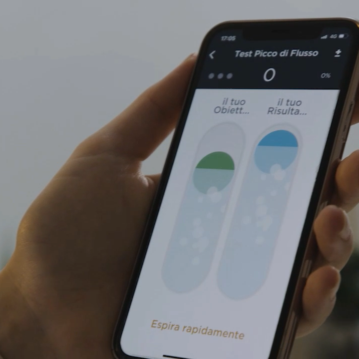
A good medical User Interface (UI) design improves usability and finally the User Experience of any medical device.
As the influence of technology in our everyday lives continues to grow, the standard for aesthetically pleasing and contemporary user interface (UI) designs in the healthcare space continues to evolve.
Healthcare professionals’ and patients’ expectations for what a medical device should look and behave like are influenced by the UI trends seen in consumer products.
Unfortunately, many of the contemporary UI trends in the consumer space are not applicable to the medical environment, due to the safety-critical applications. A misunderstanding in medical device use can result in harm for patients and caregivers. In this article, we’ll give you UI tips to design a User Interface that is both user-friendly and safe.
1. Simple Language
Designing the user interface of your medical device, you should pay attention to the language. It has to be simple, understandable, and thought not only for healthcare professionals, but also for common people using devices at home.
Designers avoid including long sentences and paragraphs and use meaningful headings and subheadings to make the communication more clear.
2. Color
Of course color plays a big part in the Medical User interface development, including color psychology, the human factors of color, and color specifications in the medical field or branding.
Experienced designers suggest limiting the color palette of a user interface between three and five colors.
A user-interface designer should also select colors carefully because specific colours often have assigned meanings in the healthcare industry. For example, red is commonly used to depict alarm information or to communicate arterial blood pressure values, and various secondary colors are associated with certain drugs and gases.
3. Simple typography
Different sizes, fonts, and arrangement of the text helps increase legibility, and readability of the texts or contents for the consumer, thereby making it easier for them to understand.
An efficient user interface that makes the Medical device user experience perfect is based on typographical rules that point towards the most important information and make screen content easy to read. To achieve these, one should commit to a single font and just a few character sizes. Using larger text sizes can make a screen seem more crowded and dated, but it can be necessary to ensure the legibility for users with visual impairments.
Another way to simplify typography is by eliminating excessive highlighting and using a single method such as bolding.
At last, when identifying the font, carefully consider whether certain characters (e.g., i I, l L, 1, 7) are prone to misinterpretation to have the complete legibility.
4. Be current and consistent
It’s very rare to create a medical device design that doesn’t already exist or have an analogous device. In the medical field, users are trained or have practiced on a specific existing model. If designing a similar device, users will expect a similar user interface design. Pay attention to similar patterns in layout and color in analogous devices and implement them into your design. By using common and simple elements in your medical user interface design, you can make your users feel more comfortable and make them get things done more quickly.
It is also important to create patterns in language, layout, and design throughout the interface to facilitate efficiency (e.g. use red color to communicate critical data, use the same word to communicate permission to proceed).
To prevent design inconsistencies, it is recommended a style guide should be created and maintained.
5. Low Screen Density
A lot of medical device displays look overstuffed with information due to which few empty spaces remain. Such space is important in a user interface, as it helps to separate information into related groups and provides a resting place for the user’s eye.
To eliminate excessive information, the user-interface designer can present secondary information on demand (via pop-ups or floating notifications), reduce the size of graphics, or reduce the amount of text.
6. Ergonomics data
The sizes of buttons, menus, fonts, windows should always be based on ergonomics data. For example, the target size of your button should be as large as or larger than the finger breadth size of the final user. Anything smaller will decrease accuracy and speed, and increase the risk of touch errors and use time. However, for medical devices, users may be wearing gloves. For touch screens, that increases their finger size and decreases the probability of the display registering the touch. Developers have mitigated this issue by increasing the size of the touch points and the sensitivity of the display.
7. Navigation Cues and Options
Moving from one place to another in a medical user interface development, a navigator can sometimes become lost. Sometimes the problem results from the user not knowing where he or she is in the user-interface structure.
Placing meaningful titles on every screen and subcomponent (e.g., message boxes and major elements) by means of a header—a contrasting horizontal bar that includes text—is helpful. Numbering the pages of an electronic document can also benefit the reader.
Navigation options and controls, such as “Go to main menu,” “Go back,” “Previous,” “Next,” and “Help,” should be grouped together in a single, consistent location so that users can easily return to a previous screen or undo an action without fear of getting lost or causing irreparable harm.
8. Grid
Making the effort to fit on-screen elements into a grid will pay off in terms of visual appeal and perceived simplicity.
Aligned elements seem less complex because they merge into a single, related set. Moreover, the human eye can generally find information more quickly when scanning a straight path rather than an irregular or discontinuous one.
9. Icons
Lately, a lot of medical devices, particularly those employing relatively large displays with high resolution, are presenting functional options—actions such as calibrating a device, setting alarms, or reading the user guide—in the form of icons. This shift within the medical industry to an iconographic user-interface style matches trends in the consumer and business software arenas.
In the healthcare market, it’s fundamental to maximize icon comprehension and give the icons a family resemblance to each other. To this end you can develop a limited set of icon elements that represent nouns, simplify the icon elements, make similar-purpose icons the same overall size and style, or reinforce icons with text labels.
The success of most medical devices is closely linked to user-interface quality. This is particularly true in cases where there is substantial market competition and the associated technology has more or less matured, making medical user-interface design quality a prominent factor in product differentiation. The safety of most medical devices is also closely linked to user-interface quality, because design shortcomings may lead directly or indirectly to use errors, with severe consequences that can include patient injury and death.
That’s why Medical device user-interface designers must aspire to the highest user-friendliness and readability. To this end, the aforementioned tips should be helpful for any kind of medical device.
If you’re looking for an UI design expert, Creanova has over 2 decades of experience of serving its clients with User Interface design for apps, website or software and for both professional and consumer use, with the aim of making the Medical device user experience better. We can support you to develop the user interface of your device, matching high aesthetics with improved usability and readability.
Our designers integrate Italian design, creativity and a Human-Centered Design in innovative and intuitive medical solutions, leveraging a deep experience in the Med-Tech industry. Contact us to discover more!

