Creanova’s designers create new healthcare family feeling for your medical devices and make them recognized in the crowd, but what is the Family Feeling?
Stand Out From the Crowd
Family feeling defines a unique style, a set of features (e.g. shape, color and finishing) which characterizes a brand or a specific product line. It allows a product to stand out from the crowd and to be recognized as part of a brand. The creation of a new family feeling starts from brand identity analysis and then includes the study of design trends and expected evolution of the brand/ product line.
One of the main characteristics is the color palette, it is the feature the final user more easily perceives. The palette is defined and respected for each product in the product line. It doesn’t mean that every product has the same color, but the used colors express the same identity.
The same rule is applied to the shape and finishing. Designer in charge of family feeling creation, defines the lines to be used for the product line, but the products will not have the identical shape, but the same style.
Family feeling amplifies the result of usability study, performed during each product design process: the user can easily understand the device operation if he has already used a product of the same line, thanks to the identical functional guidelines.
The family feeling is usually a dynamic concept, it changes over the years following the design trend evolution and brand identity development, always ensuring the link with the past.
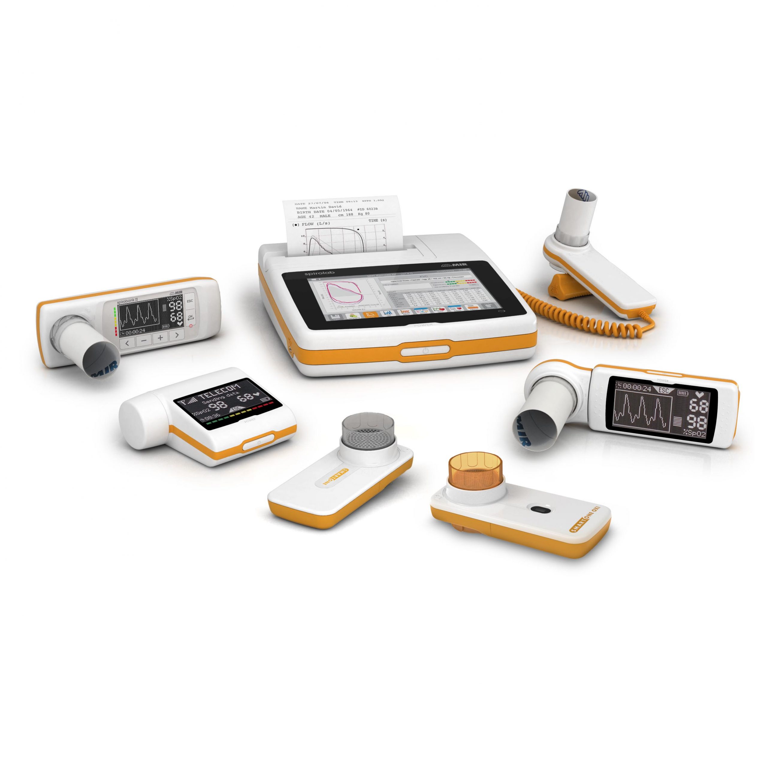
Creanova’s Designers Create Something Unique for a Spirometry Line
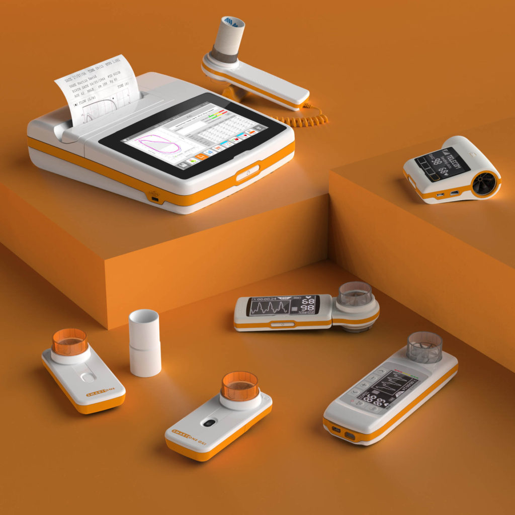
MIR, the world leader for innovation in spirometry, oximetry and telemedicine and Creanova’s long-lasting partner, challenged our designers in developing a new family feeling for its spirometry line.
It was a challenge we enjoyed and resulted in a set of unique features for MIR’s medical devices.
Creanova started from the analysis of the spirometry market, the MIR’s products and brand visual attributes to propose a new personalized identity with distinctive features (shape, color and finishing) to characterize the existing and future product portfolio.
The family feeling was defined during the design development of the Spirodoc and then it was strengthened and detailed according to the portfolio expansion. For Spirodoc, white and orange colors are chosen as the main colors: white to maintain the connection with medical industry and orange to distinguish the product from the competitors.
Spirodoc and devices developed later were characterized by shape cleanliness, volumes compactness and rational style with soft rounded corners. The family feeling distinctive details are the orange horizontal band which includes all the functional components (e.g. usb port, buttons, device connections) and the button with the characteristic shape of a pill.
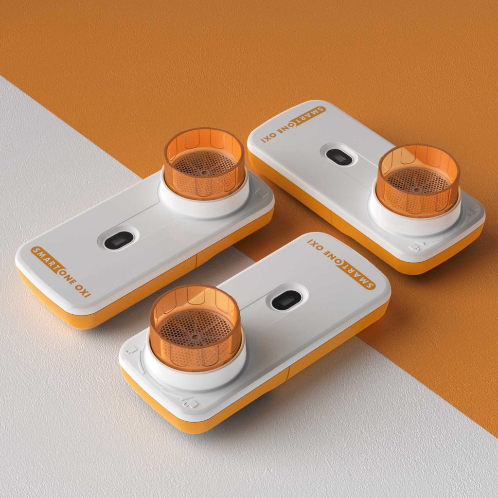
The launch of Smart One marked a new evolution of MIR’s family feeling, in line with the new design trends: the color palette was confirmed as MIR’s distinctive mark, while the shape continuity and cleanliness in shells division were increased to meet new design trends.