Color plays a crucial role in medical device color design, influencing usability, brand identity, and the emotional response of both patients and healthcare professionals. In modern medical device industrial design, color is no longer a secondary detail but a strategic element that enhances the overall user experience.
This guide outlines the key factors to consider when selecting colors for medical devices.
1. Understand the User
Effective color selection starts with a deep understanding of the end user. Designers must consider:
- User expectations and preferences
- Emotional associations (e.g., trust, precision, safety)
- Context of use (clinical vs. home environment)
Aligning colors with user perception improves both acceptance and usability.
2. Analyze Competitors
Reviewing existing products helps identify:
- Industry color standards
- Opportunities for differentiation
- Visual expectations within the market
A balance between familiarity and innovation is essential.
Typical questions during the design phase of medical devices: What are the competitors doing in the market? Are their colors bold? Dull? Should your product resemble those of your competitors or should it be markedly different? Are there any colors that are expected to be used?
3. Strengthen Brand Identity
Color is a powerful branding tool in medical product design.
A consistent color strategy:
- Enhances product recognition
- Builds trust across product families
- Supports a coherent design language
While brand colors can be used to strengthen the family feeling of medical devices, they should not limit functional or usability considerations.
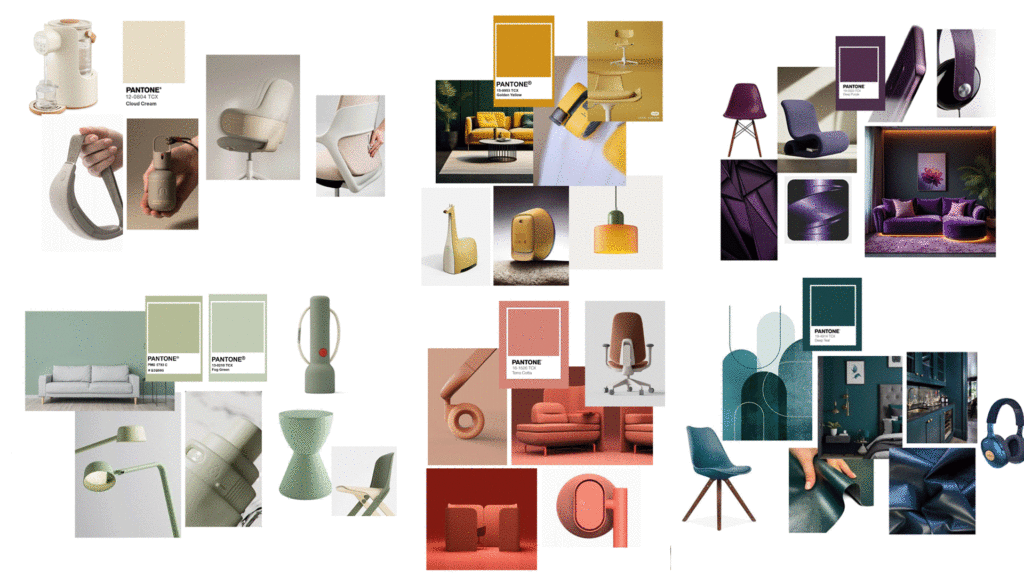
4. Apply Color Psychology in Healthcare
Understanding color psychology in healthcare helps create intuitive and reassuring devices:
- White: cleanliness, sterility, clarity
- Blue & Green: calmness, safety, balance
- Grey: neutrality and softness
- Black: sophistication (use carefully)
- Bright colors (yellow, orange): suitable for pediatric use
Therefore, cultural differences must always be considered when defining color meaning.
White
White has a strong connotation of cleanliness/sterility and purity, so it is very appropriate in a medical environment.
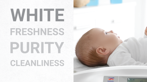
And because it is a colour that stands out a lot, using white for the majority of the device allows it to describe and draw attention to the user’s input areas, thus improving the Medical Device industrial design and usability. One downside is that it can appear cold and strong to the eyes.
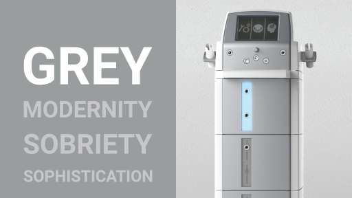
Light grey
Light grey as white is the most commonly used color in medical environments, light grey can be a viable alternative to differentiate your company’s product. Light grey can be seen as softer and calmer than bright white.
Blue
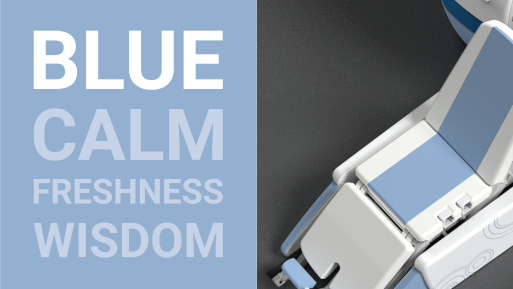
Blue has a calming effect and gives serenity, which is why it is one of the predominant colors in medical device design.
Green
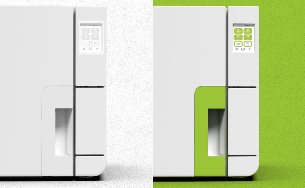
Green has a calming effect and is commonly associated with balance, harmony, and reassurance making it particularly suitable for clinical environments where patient comfort is essential.
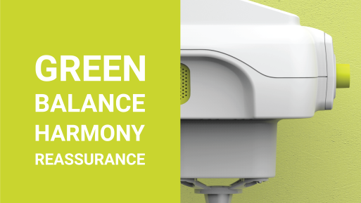
Brighter tones of green, or other accent colors, are typically applied to functional areas of a device to guide user interaction and reduce perceived complexity.
These colors often align with the brand’s visual identity, reinforcing recognition and consistency when translated into the product design.
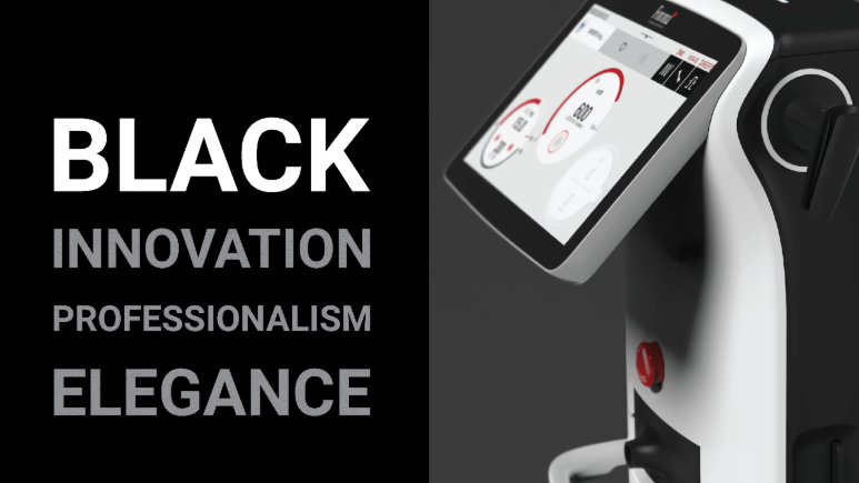
Black
Black conveys elegance, sophistication, and technical excellence. It is increasingly used in high-tech and consumer-oriented products, including innovative medical devices, to communicate premium quality and cutting-edge design.
When applied thoughtfully, black can give devices a bold and distinctive identity, enhancing their perceived value and creating a strong “wow effect” that resonates with modern users and clients.
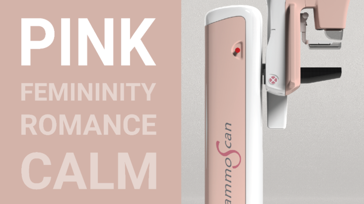
Pink & Red
Pink conveys calmness and reassurance. In Western cultures, it is often associated with femininity, which should be considered during the design phase.
Red expresses energy and urgency. It is widely used in critical elements such as emergency buttons or AED devices, where immediate recognition is essential. However, due to its strong association with blood, it should generally be used sparingly primarily to highlight key interaction points or safety features.
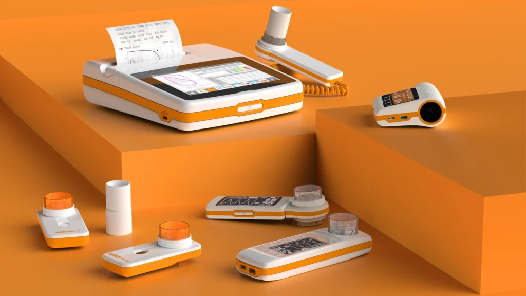
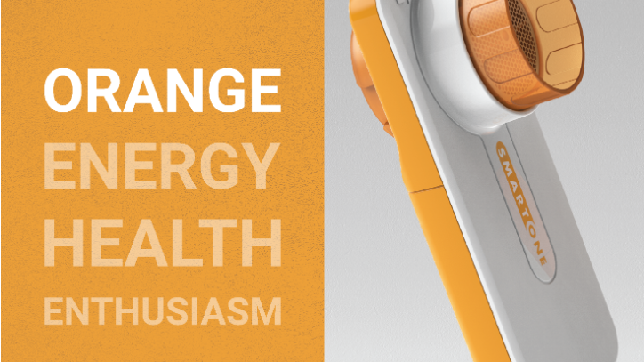
Orange & Yellow
Orange is a happy, energetic and comforting color. Yellow is sunny, optimistic and friendly, which makes it great for pediatrics. Too much yellow can be overpowering though, so consider it carefully.
Purple
Purple can be associated with religion and spirituality, and, as such, can be used to reassure recovering patients. Lighter shades of purple, such as liliac, are perceived as more delicate and feminine. Purple is starting to be used more often in medical devices.
Despite this brief explanation of connotations, the symbolism of color varies from culture to culture and this should be kept in mind during the color decision process.
5. Consider the Usage Environment
Lighting conditions and surroundings affect color perception.
Devices should be tested in real environments to ensure:
- Consistency across settings
- Proper visibility
- Visual comfort
6. Evaluate Sterilization Impact
Sterilization processes can alter colored materials:
- Gamma and e-beam radiation may cause yellowing
- EtO and plasma have minimal impact
Material and color choices must account for these effects to maintain visual quality over time.
7. Adapt to Product Scale
Color application varies depending on device size:
- Small devices: more flexibility with bold or saturated colors
- Large devices: neutral tones to avoid visual overload
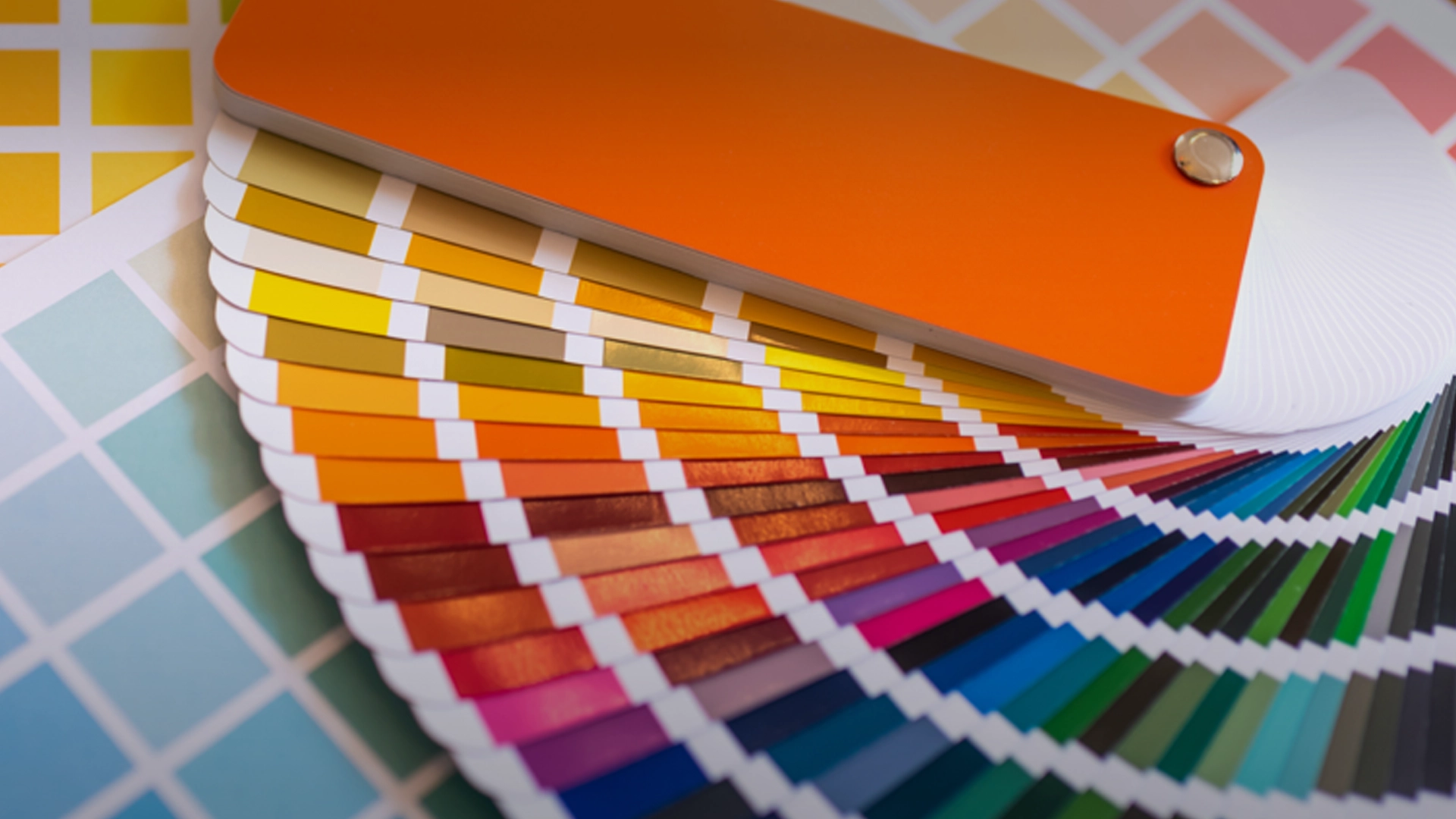
8. Follow Design Trends Carefully
Current healthcare product design trends influence perception and market appeal. However:
- Align colors with user lifestyle expectations
- Avoid overly trendy colors for long lifecycle products
- Ensure compatibility with home environments
9. Use Color Coding for Usability
Color coding improves medical device usability by guiding user interaction:
- Highlight key interaction points clearly
- Use a limited number of colors (max 3–4)
- Maintain consistency across the device
10. Ensure Biocompatibility
For devices in contact with patients, colors must comply with safety standards.
Using certified dyes and materials ensures:
- Long-term durability
- Regulatory compliance
- Patient safety
Our team of experts can help you choosing the right material for your medical device.
Conclusion
Color is a strategic component of medical device color design, impacting usability, branding, and patient experience.
By combining user research, color psychology, and engineering constraints, designers can create intuitive and effective healthcare products.
A human-centered approach to color selection ensures that medical devices are not only functional but also visually aligned with the needs of modern healthcare environments.
Contact us to know more!
