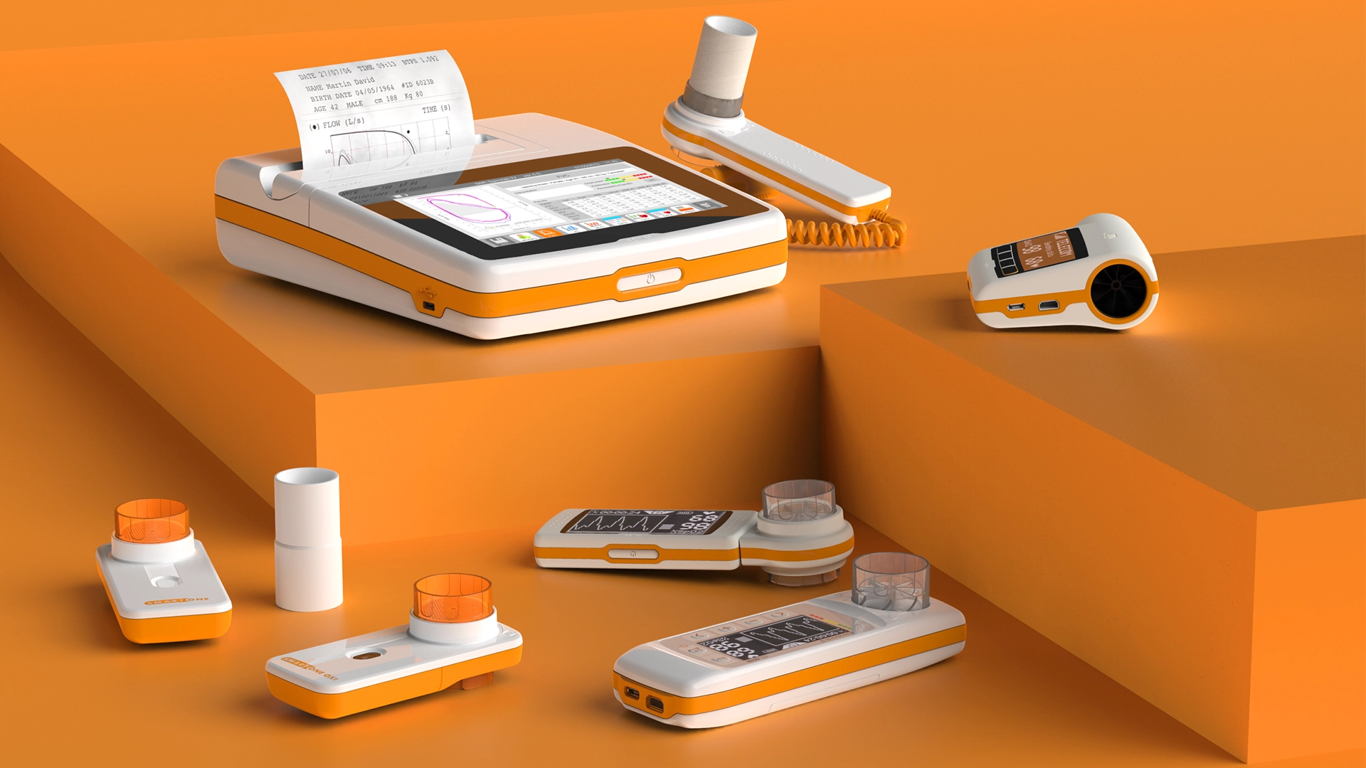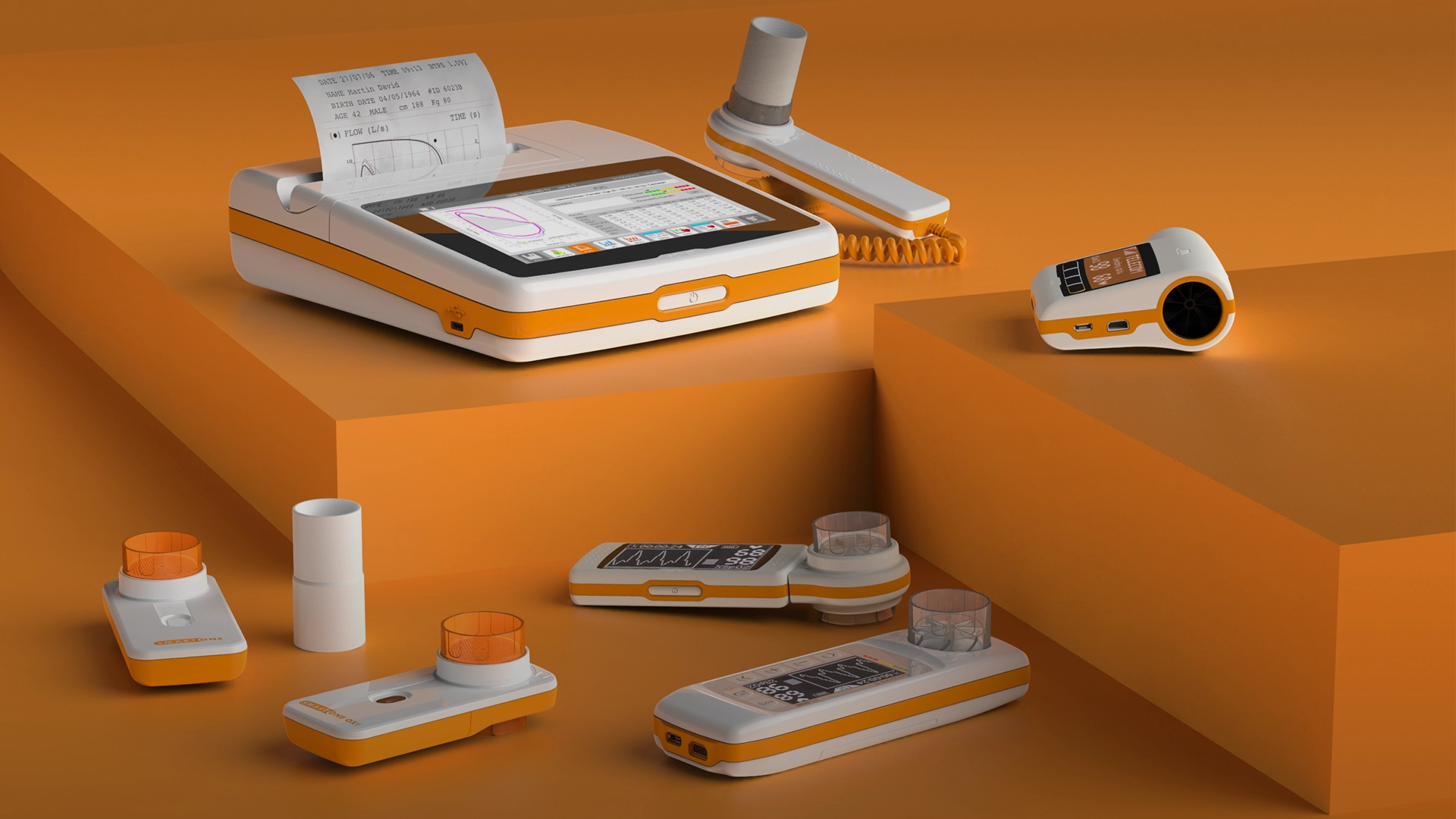
How can you distinguish a BMW car from the crowd? Kidney-shaped grille, crease line and counter curve in the rear window helps much more than the logo.
This kind of unified product family is the result of a successful visual brand language, a strategy to create consistency across the brand.
What’s Visual Brand Language?
The visual brand language lives as an intermediary between the brand overall and the brand’s individual products.
A Visual Brand Language is a framework for product design used to create a cohesive product family. With an effective and consistent VBL, the look and feel of your products will communicate what’s great about your brand in the most direct way possible. Your customers will recognize your products. Having a VBL also makes innovating and designing new devices more efficient, because of the existing set of elements to design the next product for your brand.
The foundation of any VBL is the brand and when applied consistently across a branded product line, the effect is a unified family of products that continually delivers on your brand promise.
If you think about some products by the world’s most recognizable brands, you could pick out their products in a lineup of ten similar products in a matter of seconds, even without ever seeing a logo or nameplate. They could release a completely new product that they’ve never produced before, and you would still be able to identify the brand immediately. Why? Because they’ve developed a consistent visual brand language, and followed it effectively.
While the quality industrial design makes your products great, the visual brand language makes them undoubtedly yours in people’s minds.
Elements Of A Visual Brand Language
A VBL consists of elements that help your medical device design fit together visually and in the way it functions for users.
Elements of your visual Medical Brand language design might include:
-
Color — not just the brand’s signature colors, but a unified system of colors for key product components.
-
Form — the overall physical profile of your family of products should be uniform, whether it’s curved and organic or solid and angular for example.
-
Materials and textures — a consistent use of materials and textures builds confidence because products feel similar in users’ hands and communicate the same message.
-
Physical elements — handles, grip areas, buttons, and other physical elements that cue users on how to pick up or interface with the devices should also be consistent
- Brand application — define how and where the brand logo is placed across the suite of products.
These elements combine to create an impression of precision and quality, and underpin the Medical Device development.
Why Visual Brand Language Matters In Medical Devices Market?
A strong visual brand language can help you reach more people, faster, and inspire loyalty especially in a high-trust industry like healthcare.
Healthcare has changed over the past few years. Like other industries, it’s become consumer-driven: patients, providers, and anyone else who purchases medical devices have developed knowledge and the same behaviour of typical consumer markets (e.g. electronics market). As a matter of fact, 88% of doctors use the internet and social media to research medical devices.
The main benefits of a strong visual brand language for a Med-Tech company are:
-
Differentiate yourself from the competition: Healthcare services, pharmaceuticals, and medical devices are frequently treated like commodities. They all seem more or less the same. A strong brand shows how you’re different and makes you seem like the higher quality solution. This is why many people choose name brand painkillers for their headache over generic.
-
Attract investors and partners: A developed brand shows that you understand your purpose and goal. You aren’t just another company competing in a noisy space. You’re on a mission. Investors and partners will be more willing to work with you when they know you’ve got your stuff together.
-
Reduced Learning Curves for the user: When you leverage the power of a visual brand language, you’ve erased the first barrier for your users to understand your product. If they already know what the power button looks like, how the interface functions, and how to navigate the site, they’re more likely to have a positive overall experience without experiencing frustration.
-
Customer Retention: The familiarity and trust that come from a consistent family of products build confidence that she’s chosen the right brand. Your brand stands for something. Make sure that stance is clear every time medical professionals use every one of your products.
-
Guardrails for next medical devices: A defined visual brand language will make it easier for the design team to create new concepts that are on point and consistent, improving the Medical Device industrial design. Your guidelines can also prevent them from creating anything that could be perceived as not belonging to your brand.
A consistent Medical Brand language design is even more important in the home healthcare market where consumer buying habits apply and users aren’t trained medical practitioners. Companies with a large suite of consumer products need to document the VBL in a strategic way so the brand doesn’t become fractured.
If you’re looking for an expert in industrial design and visual brand language, Creanova’s designers integrate Italian design, creativity and a Human-Centered approach in innovative and intuitive medical devices, honoured by the most prestigious design awards.
The interconnection of design teams with engineering and manufacturing ones ensures a producible medical device since the early stages.
Contact us to know more!